


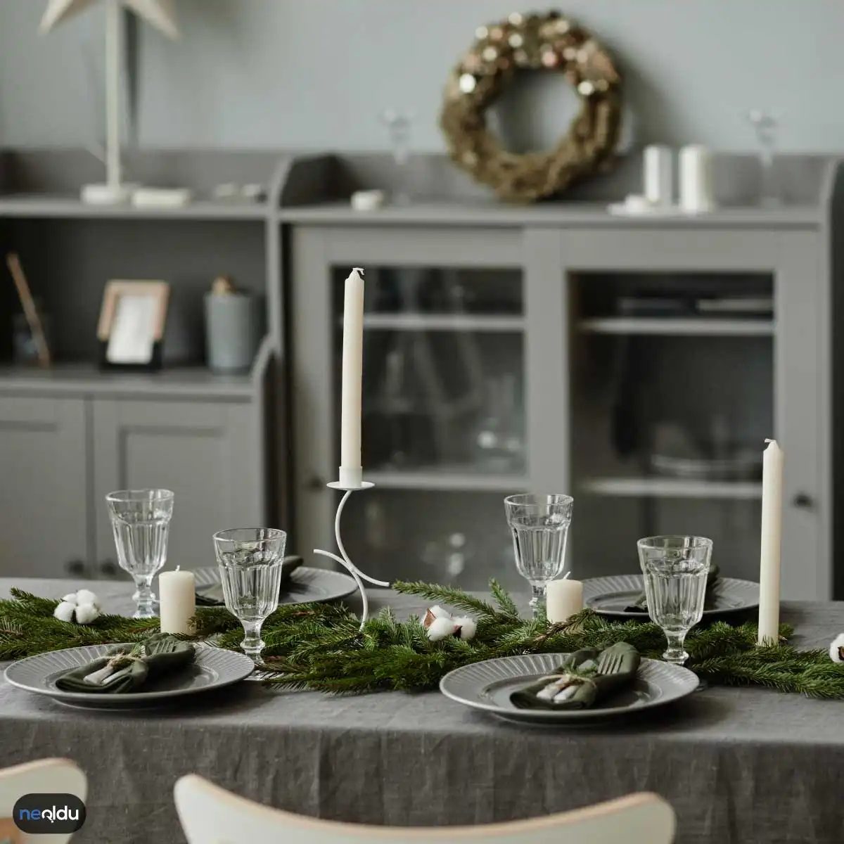
Your home isn’t just a shelter. It’s a canvas. It’s where you exhale after a long day. So, picking the right decor isn’t about following trends blindly; it’s about creating a space that actually feels like you. That’s why gray has taken over. It’s not just a color. It’s a foundation.
Gone are the days when gray meant dreary or hospital-like. Today, it’s the heavyweight champion of interior design. Why? Because it’s neutral without being boring. It’s flexible. You can slap it on walls, throw it on sofas, or weave it into textiles, and it just works. It fits the modern minimalist vibe perfectly. It doesn’t scream for attention. It lets the architecture and your personal items shine.
If you want to create a space that feels expensive but lived-in, starting with gray is a smart move. It’s the ultimate blank slate for a DIY renovation.
Зміст
How to Use Gray for Modern Minimalist Decor
Minimalism isn’t about having nothing. It’s about having only what matters. Gray supports this philosophy. It calms the eye. It reduces visual noise. When you pair gray with clean lines and natural materials, the result is sophisticated but approachable.
Here’s how to break it down without overcomplicating it.
1. Start with the Walls
Painting walls is the most high-impact DIY project you can do. It’s also the cheapest. But not all grays are created equal. Some lean blue. Some lean green. Some lean pink. For a modern look, you want a gray with a slight warmth to it. Think greige (gray-beige). It prevents the room from feeling cold.
- Choose a matte or eggshell finish for walls. Gloss highlights imperfections.
- Test samples on the wall. Light changes everything. Check it in the morning and at night.
- Don’t skimp on quality paint. One coat won’t cut it. Two coats ensure depth.
2. Layer with Texture
A room with only gray walls can feel flat. That’s where texture comes in. You need contrast. Not just color contrast, but tactile contrast.
- Add a chunky knit throw in cream or white.
- Use a jute or sisal rug. The roughness against smooth painted walls feels grounded.
- Incorporate wood elements. Light oak or walnut furniture breaks up the monotony.
3. Lighting Changes the Hue
Gray shifts. It’s alive. In natural light, it might look cool and crisp. Under warm LED bulbs, it can turn muddy or pink. This is why lighting is critical in gray spaces.
- Use 2700K to 3000K bulbs for a warm, inviting glow.
- Avoid harsh overhead lights. Use floor lamps and table lamps to create pools of light.
- Consider dimmers. Controlling light intensity lets you adjust the mood of the room instantly.
Why Gray Is the Smart Choice for DIYers
Let’s be real. Renovating is stressful. It’s expensive. It’s messy. Gray is forgiving. If you make a mistake with a piece of furniture or a throw pillow, you can swap it out easily. Gray doesn’t fight with other colors. It plays well with
Building the Gray Foundation
Gray isn’t just a color; it’s the structural backbone of modern minimalism. It offers that elusive mix of sophistication and restraint without screaming for attention. If you’re stripping back the clutter to build a space that breathes, gray provides the perfect neutral canvas. But getting it right requires more than just buying a paint can. You need to understand how different tones interact with light and other materials.
The key lies in the palette. You aren’t just painting walls gray. You are layering it against white ceilings, jet-black accents, and various neutrals. This triad—gray, white, black—creates high contrast that feels intentional, not accidental. Think of it as a visual hierarchy. The white ceiling lifts the room. The black furniture anchors it. The gray walls connect them.
Choosing the Right Fixtures and Furniture
Minimalist design hates fuss. So, when you pick out your gray sofas or dining tables, look for clean lines. No ornate carvings. No excessive detailing. The furniture should support the style, not compete with it. A simple, upholstered gray armchair with exposed legs works better than a bulky, overstuffed one. It keeps the floor visible. It keeps the space feeling airy.
Material choice matters here, too. Matte finishes absorb light and feel softer. Glossy surfaces reflect it and feel sharper. For a truly modern look, stick to matte or satin textures. They hide fingerprints better and blend seamlessly into the background.
Lighting Sets the Mood
Lighting in a gray room can make or break the vibe. Too much harsh overhead light makes gray look cold and clinical. Too little makes it look murky and depressing. The goal is layered, diffused illumination.
Use recessed spotlights aimed at specific features rather than flooding the whole room. This creates pockets of interest. Add a minimalist pendant light or a sleek floor lamp in the corner. The shade should be simple—fabric or frosted glass works best to soften the beam.
“Lighting doesn’t just illuminate; it sculpts the space.”
Test your paint swatches at different times of day. North-facing rooms need warmer grays to counteract the cool daylight. South-facing rooms can handle cooler, sharper grays. The light changes the color. Always remember this.
Textiles and Strategic Accents
In a minimalist home, every object must earn its place. Textiles are no exception. Gray curtains, rugs, or throw pillows add texture without adding noise. They break up large planes of wall or floor, giving the eye somewhere to rest.
But here is the trap: don’t overdo it. A room with too many pillows looks cluttered, not cozy. Choose one or two statement pieces. A high-quality wool rug in a charcoal shade can define a seating area without visual clutter. Keep the patterns subtle. Geometric lines work well. Stripes can elongate a room. Avoid busy florals or loud prints. They fight against the minimalist ethos.
Art should be sparse. One large, impactful piece on a gray wall is more effective than a gallery wall of small frames. The negative space around the art is just as important as the art itself. Let it breathe.
The Power of Negative Space
Minimalism isn’t about having nothing. It’s about having only what you need. Gray walls help this philosophy by receding visually. They make empty corners feel intentional rather than neglected.
Use open shelving sparingly. Fill it with a few curated items—a book, a ceramic vase, a small plant. Leave 60% of the shelf empty. This “white space” (or in this case, gray space) directs focus to the objects that remain. It creates a sense of calm and order.
A simple, floating desk in a lighter gray can serve as a functional workspace without dominating the room. It keeps the floor clear. It maintains sightlines.
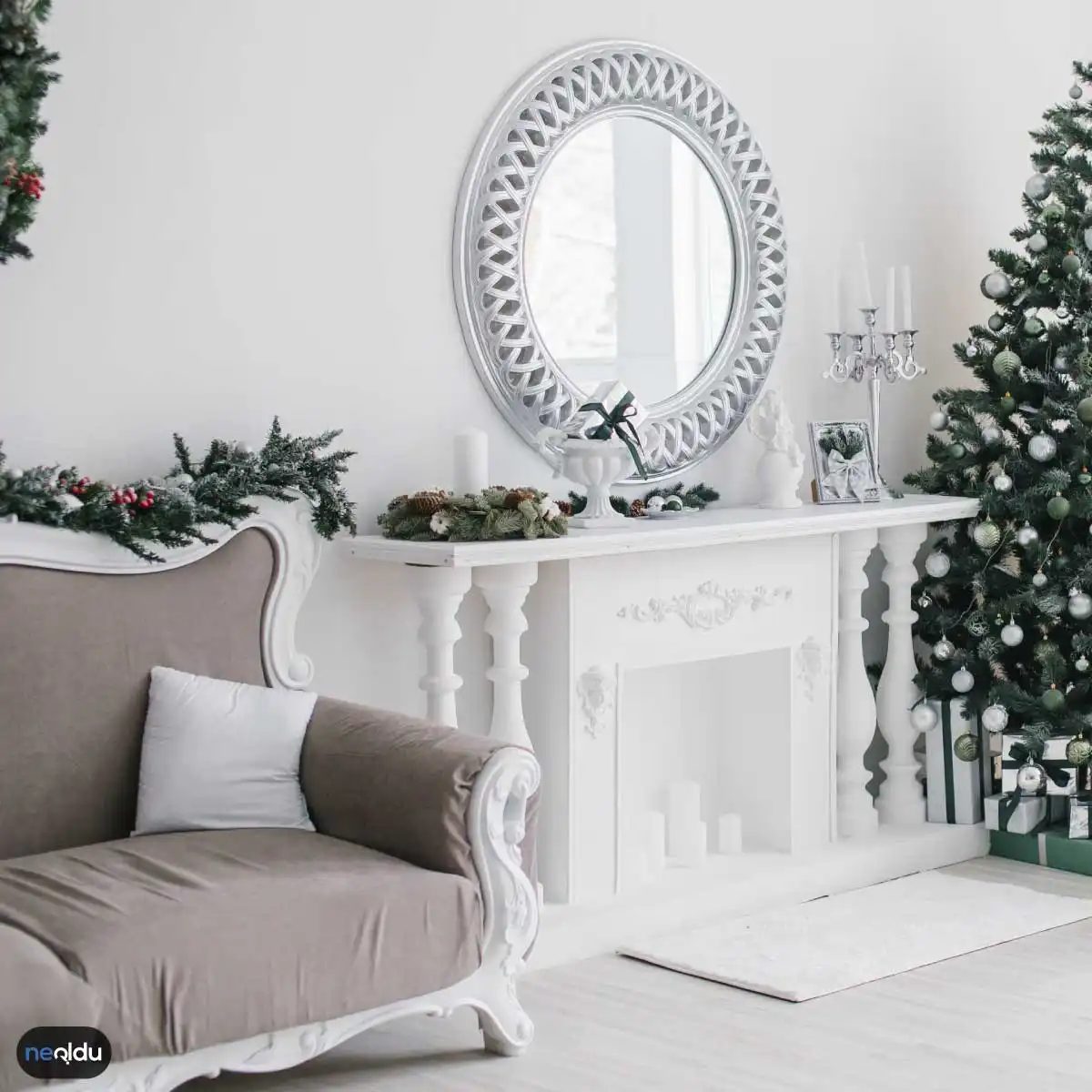

Gri artık ev dekorasyonunda sadece bir tercih değil, neredeyse bir zorunluluk gibi görünüyor. Sadelik, şıklık ve çok yönlülüğüyle bu ton, farklı tarzlara mükemmel uyum sağlıyor. Peki, gri renk ile evinizi dekore etmek için ilham verici fikirler neler? İşte evinizdeki havayı değiştirecek detaylar.
Gri Duvarlar
Gri duvarlar, odalarınıza anında sofistike bir hava katar. Açık gri tonları, mekanları daha ferah ve aydınlık gösterir. Koyu gri tonlar ise tam tersi etki yapar; derinlik ve sıcaklık katar. Ancak burada dikkat edilmesi gereken nokta, doğru ton seçimidir. Gri duvarları beyaz mobilyalar ve aksesuarlarla tamamladığınızda modern bir tarz elde edersiniz. Duvarları griye boyamak yerine, gri desenli bir duvar kağıdı kullanarak da ilgi çekici bir görünüm sağlayabilirsiniz. Bu yöntem, özellikle dar alanlarda veya az ışık alan odalarda çalışır.
Gri Mobilyalar
Gri renkli mobilyalar, evinize sofistike bir görünüm katar. Gri koltuklar, oturma odasında rahat bir atmosfer yaratır. Gri yemek masası sandalyeleri ise yemek odasında zarif bir tarz sunar. Ahşap veya metal detaylara sahip gri mobilyalar, odanın tarzına bağlı olarak modern veya endüstriyel bir estetik oluşturabilir. Bu mobilyaları seçerken malzeme kalitesine dikkat etmelisiniz. Kumaş koltuklar daha yumuşak bir his verirken, deri gri koltuklar daha uzun ömürlü ve pratik olabilir.
Gri Aksesuarlar
Gri renkli aksesuarlar, odalarınıza dokunuşlarınızı ekleyerek dekorasyonunuza zarif bir şekilde uyum sağlar. Gri perdeler, yastıklar, halılar veya dekoratif objeler, mekana derinlik ve dokunuş katmanın harika bir yoludur. Ayrıca, gri tonlarda seçtiğiniz tablolar, heykeller veya vazolar, odanın görsel çekiciliğini artırabilir. Bu aksesuarları değiştirerek mekana sezonluk bir yenilik katmak da mümkündür.
Grinin Hangi Tonları Evde Kullanılabilir?
Grinin tonları, mekanın ışık almasına ve büyüklüğüne göre değişir. Açık gri tonları, küçük odalar için idealdir. Koyu gri tonlar ise geniş alanlarda daha iyi sonuç verir. Hangi tonun size uygun olduğunu anlamak için küçük örnekler deneyebilirsiniz.
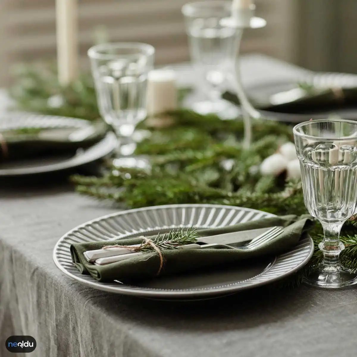
Gri artık sadece arka plan rengi değil, dekorasyonun yıldızı haline geldi. Doğru tonu seçmek, mekana derinlik katarak istediğiniz atmosferi yaratmanıza olanak tanır. Sıcak mı, ferah mı, yoksa dramatik mi? Seçim size kalmış.
Açık Gri ile Ferahlık Kazandırın
Küçük veya dar alanlarda hapsolmuş hissediyorsanız, açık gri tonları kurtarıcıdır. Bu renkler ışığı yansıtarak odaları daha geniş ve havadar gösterir. Duvarlarınızı bu tonlarda boyarsanız, mekanın ağırlığı azalır. Minimalist ve modern bir görünüm hedefliyorsanız, açık gri zemin üzerine beyaz veya pastel tonlardaki mobilyaları yerleştirmek etkili bir stratejidir. Bu kombinasyon, odaya hafiflik ve dinginlik katarak sakinleştirici bir etki yaratır. Araç olarak mat boya tercih etmek, yüzeydeki kusurları gizlemeye yardımcı olurken, pürüzsüz bir görünüm sağlar.
Orta Gri ile Zarafet ve Sıcaklık
Daha sofistike bir hava arıyorsanız, orta gri tonları idealdir. Bu tonlar, mekana modern bir tarz katarken aynı zamanda sıcaklık da sunar. Ahşap veya doğal dokulu mobilyalarla birleştirildiğinde, orta gri mükemmel bir uyum sağlar. Örneğin, orta gri bir duvar arkasına ceviz veya meşe rengi bir sehpa yerleştirmek, doğal ve şık bir his yaratır. Aksesuarlarda bronz veya bakır tonları kullanarak dengeyi kurabilirsiniz. Bu kombinasyon, odada dinamik bir denge oluştururken sofistike bir atmosfer sağlar.
Koyu Gri ile Derinlik ve Dram
Büyük ve geniş mekanlarda koyu gri tonları kullanmak, odaları sıcak ve şık bir atmosferle doldurur. Bu tonlar, mekana derinlik ve dramatik bir etki katar. Koyu gri bir duar, odada güçlü bir odak noktası olabilir. Ancak dikkat etmeniz gereken nokta, doğru aydınlatma ve kontrast renkler kullanmanız gerektiğidir. Parlak renkli mobilyalar veya aksesuarlar, koyu gri ile mükemmel bir kontrast oluşturarak odada görsel ilgiyi artırır. Koyu gri boyalar genellikle iki kat sürüldüğünde en iyi sonucu verir, bu da renk derinliğini artırır.
Soğuk Gri ile Modern ve Minimalist Estetik
Minimalist veya endüstriyel tarzdaki dekorasyonlar için soğuk gri tonları idealdir. Bu renkler, mekana serinlik ve modernlik katar. Soğuk gri duvarlar, metalik veya cam detaylarla birleştirildiğinde temiz ve sade bir estetik sunar. Beyaz veya siyah renkli mobilyalar, bu tonlara eşlik ederek minimalist bir görünüm sağlar. Soğuk gri tonlarında boya kullanırken, odadaki ışıklandırmanın soğuk tonlu lambalarla desteklenmesi,

Grey is neutral. It’s a color the human eye processes instantly, evoking a sense of gravity and stillness. Home decor and furniture trends shift with the relentless pace of fashion—clothes, shoes, and accessories change every season. But keeping up with interior design trends is a different beast entirely. You can’t just buy a new jacket to update your look.
Grey dominates architecture for a reason. It’s not just trendy. It pairs with literally everything. You can combine it with earth tones or brights without breaking a sweat. But you have to watch the shades. Dark grey can swallow a room whole if the lighting isn’t dialed in. Fix that early, or you’ll be staring into a void.
Choosing the Best Grey for Your Walls
Over the last decade, grey has become the most popular wall color for good reason. It’s one of the best options out there. It fits any style. It makes furniture pop. It doesn’t show dirt easily. If you see grey walls in almost every home, there’s a practical logic behind it. It’s a blank canvas that works.
Using Grey in the Kitchen
Modern kitchens often layer various shades of grey. In one striking example, stainless steel appliances complement the cool tones. Red accents inject life into the space. This proves that grey doesn’t have to be boring. It accepts bold contrasts beautifully. When you’re renovating, don’t fear the mix. Let the grey ground the brighter elements.
From Decor to Art
Grey has a unique superpower. It appeals to people with wildly different tastes. It acts as a mediator. In large-scale art installations, multiple grey tones blend together seamlessly. It transcends mere decoration. It becomes art. If you’re painting a feature wall, consider layering two or three shades. It adds depth without shouting.
Grey in the Bathroom
Consider a attic bathroom with a sloped ceiling. Floor-to-ceiling tiling in grey creates an immersive experience. It’s not just a color choice. It’s a structural highlight. Grey reflects light differently than white, making the space feel expansive yet cozy. When you’re tiling a small room, grey hides the grime better than white anyway. Practicality meets aesthetics.
The Living Room Anchor
In living room design, grey often takes the spotlight. A dark grey TV wall paired with light grey sofas creates balance. White sheer curtains and black accessories tie it together. It’s a masterclass in contrast. You don’t need expensive furniture to make this work. Paint is cheap. Impact is high.
Selecting Grey Furniture
Choosing the color for sofas and seating groups matters. Too light? You’ll be scrubbing stains for years. That’s the last thing you want on a couch. Too dark? It feels severe and imposing. Bright colors? They can tire your eyes after a few hours. Grey hits the sweet spot. It’s durable. It’s sophisticated. It’s forgiving.
Which Decor Styles Fit Grey Best?
Grey is versatile. It works in modern and minimalist spaces. It fits industrial lofts with exposed brick. It anchors Scandinavian designs with its calm neutrality. Even classical settings can use it as a backdrop. It adds elegance without demanding attention. If you’re unsure where to start, grey is the safest bet for any style.
What Atmosphere Does Grey Create?
It creates calm. Elegance. Stillness. Lighter greys open up a room, making it feel airy and bright. Deeper shades add weight and warmth. Grey interacts well with other colors. It creates contrast that draws the eye. Use it to highlight architectural details or to soften a harsh corner.
Where Should You Use Grey?
Almost anywhere. Living rooms benefit from its relaxing vibe. Bedrooms use it for restful nights. Kitchens and bathrooms get a modern upgrade. Even home offices see improved focus in grey environments. It’s a workhorse color. Don’t limit it to one room. Let it flow through the house.
Decorating with Grey Walls
You can sculpt different moods with paint alone. Light grey sets a minimalist stage. Dark grey adds drama. Pair grey walls with white or pastel furniture for a chic look. Use accessories to break the monotony. Metallic finishes or vibrant cushions can liven things up. It’s all about the layers.
Styling Grey Furniture
Grey furniture brings sophistication. A grey couch invites relaxation. Grey dining chairs add grace to meals. Mix neutrals with bold accents for visual interest. The key is texture. Velvet, linen, or leather on a grey piece changes how light hits it. Pick materials that match your lifestyle, not just your Pinterest board.
The question isn’t whether to use grey. It’s how much is too much? Once you paint the walls, the real work begins. Finding the right fixtures. The right rugs. The right balance of light. It’s an endless puzzle. But at least the pieces fit.


